 Array
ArrayDatum objave
18. julij 2026
My design journey started in my teenage years in the late nineties of the previous century at the beginning of the digital age. Back then digital design was at it’s own beginning and I started as a pioneer of the craft that is today an established art and a normal process of every organisation, institution or a brand. Knowledge was hard to find as standards were not even created so I primarily learned from corporate branding of the 20th century and on the other side growing with the developing standards. My vision from the start was that all visual is just curated physical information presented in the visual way. By creating projects for business as well as government institutions I had respect for the hierarchy and I personally I have always loved history which is also the template to everything that we are today. On my way to gaining knowledge I could not get past the way design evolved through time and where contemporary design came from. Where corporate work gave me the current driver of progress and opportunity to become a professional I saw that national symbolism and it’s roots in heraldry and vexillology was superior in the meaning and influence on the world.
I joined Heraldica Slovenica with the reason to learn about the way symbolism evolved in the thousand years until today and gain the other side of the knowledge which was the missing piece i understanding what design is. I saw that I cannot be a good designer if I don’t know and respect the norms of heraldry and vexillology and I am also at an impression that a flag or coat of arms designer today cannot be a good designer if they do not know the side and the rules of (digital) design. And soon into my involvement with heraldry and vexillology I saw that they lacked the technical edge that came only late to their practices. Where heraldry and vexillology primarily focus on rules and both of them come from design on matter, digital design and branding is a space in which they inevitably came to and it had some rules which both now had to adapt as well. Today flags and coat of arms where they are used as official symbols are a part of branding and in branding the symbol is only one look. It can not be interpreted by the artist by following the rules, it must be used and reproduced exactly and the symbol must be prepared in a certain standard in order to be applicable and usable. Because that joining of the two worlds is not complete, part of the problems we have with heraldry and vexillology in today’s use exist.
Until now I have produced more than hundred logos and visual identities along with the books of standards, in which symbols are designed with very strict and exact definitions of usage. Because of it’s commercial need and growth the corporate world evolves faster than the national level of symbol usage. Every brand logo of a big company has perhaps hundreds of pages of brand identity usage, where every symbol is defined exactly and nothing is left to chance. That is the only way a brand can control the usage and application of their symbols when they are distributing it for further usage. On the national level things are not that way and national symbols, flags are left much more to the interpretation of producers. There are also laws for the symbols that are very loosely set and sometimes laws are also braking the correct definitions of usage and reproduction.
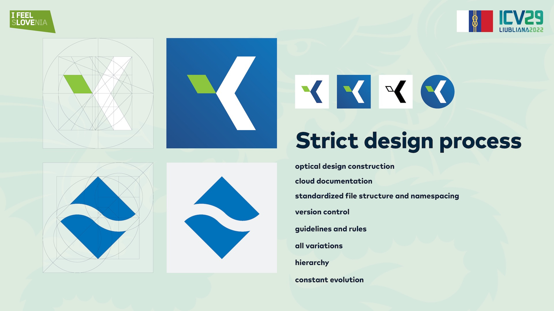
When we talk about technical design and definition of a symbol we talk about it’s concept, design, preparation and most importantly it’s end or production form. Good design processes will make our path of the symbol easier and guide us towards a better end result which is he one ha will be actually used and seen.
We have many areas of technical design from vector design, file formats, symbol versions or variants, positions, rules of usage, type and colour definitions to name a few.
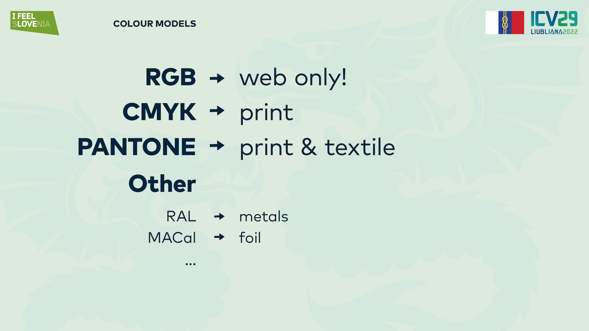
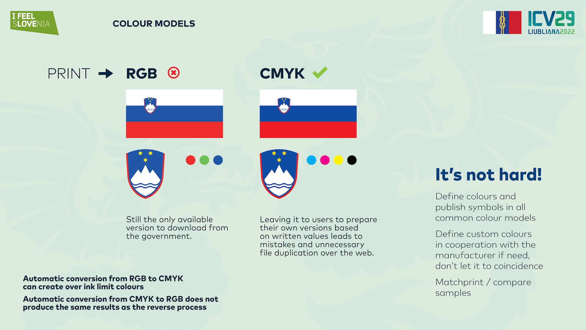
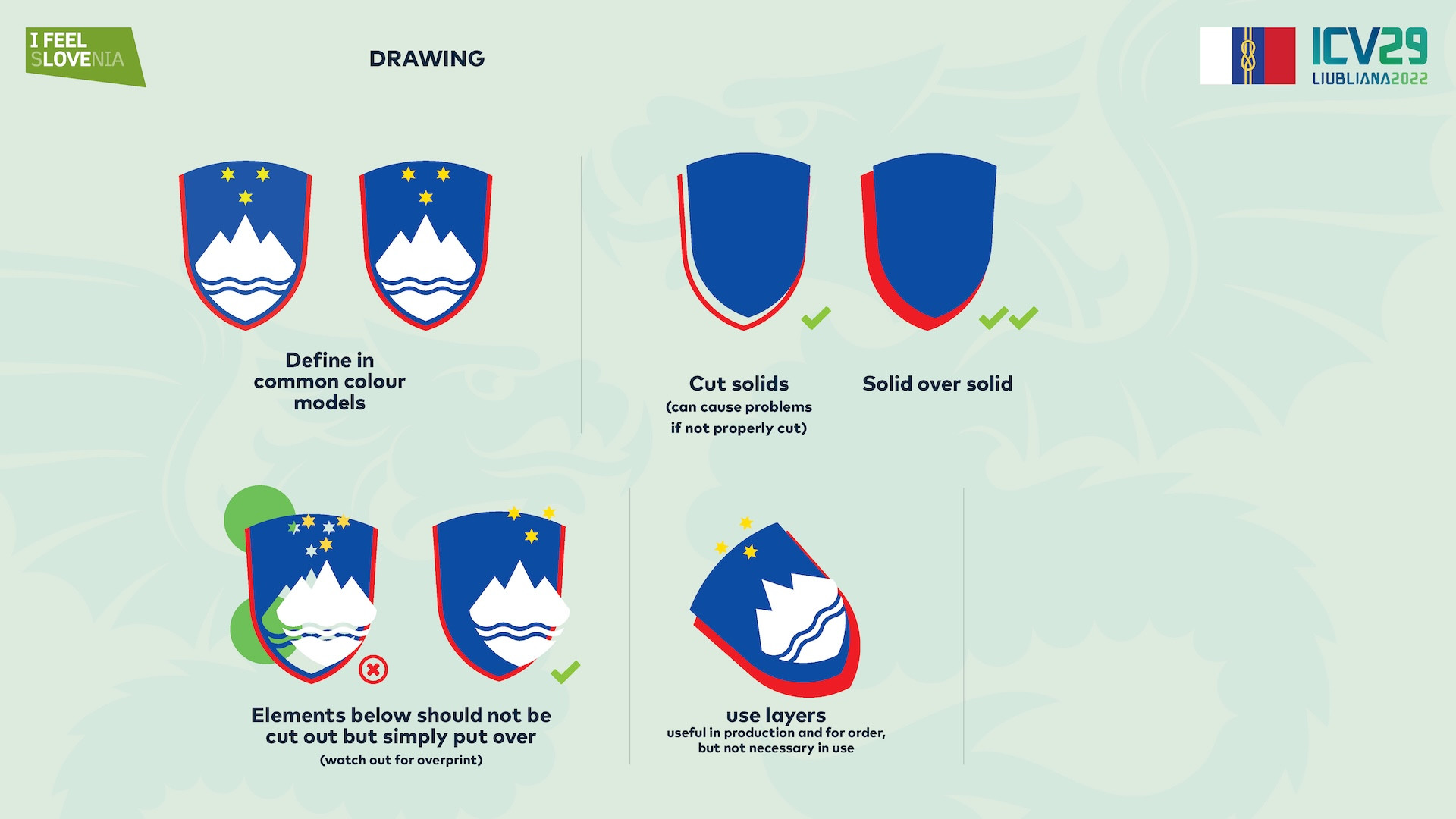
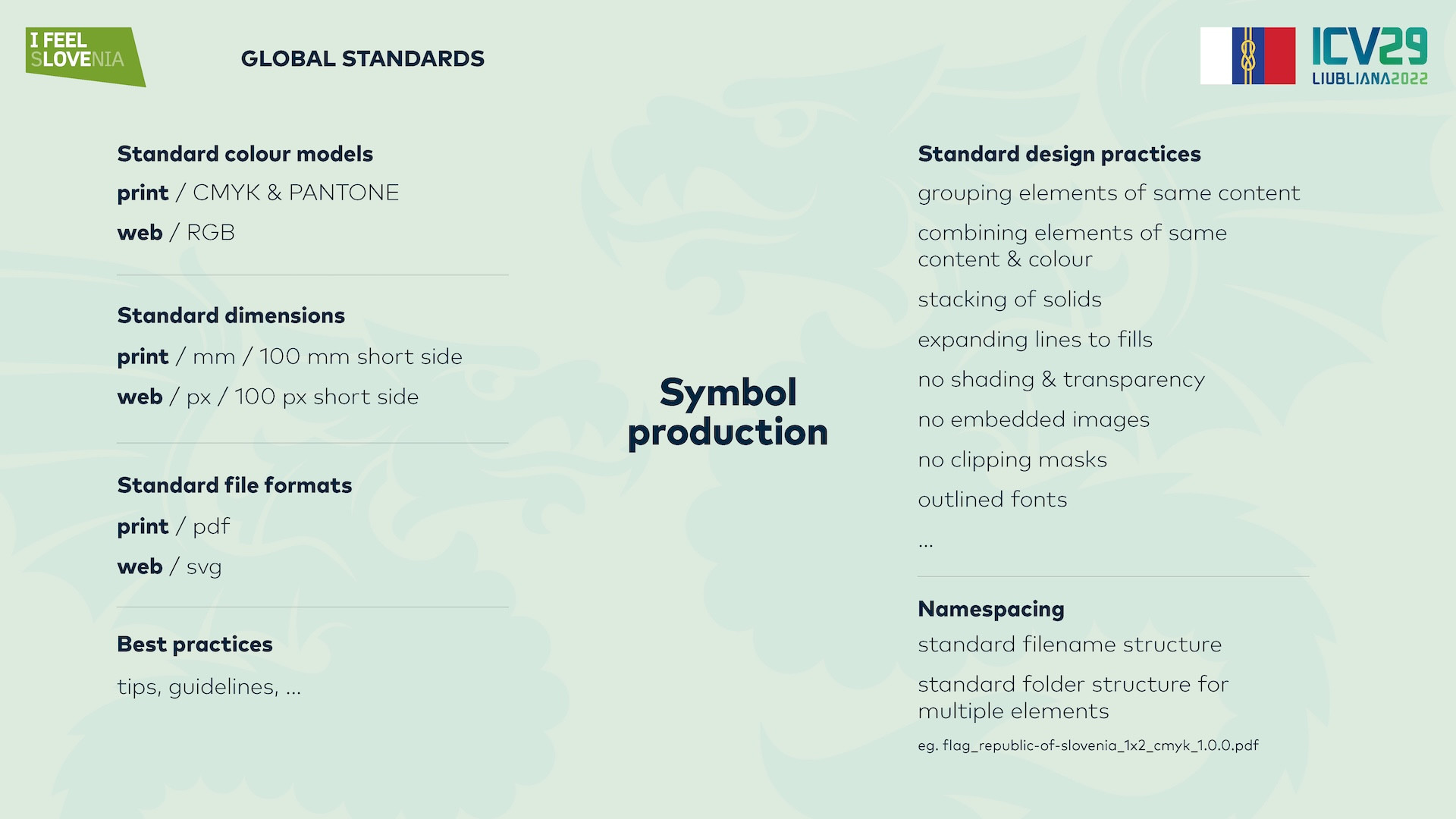
In the area of colours we know multiple digital colour models which differ by the medium of usage. Computers and displays use RGB colour format, while print global standard is primarily CMYK or in production for example PANTONE. If the symbols are designed in RGB format, they lack the definitions for printing. This results in colour conversion when trying to print RGB file in print and the results will not be consistent. Symbols should therefore be designed in multiple colour models. Primarily in CMYK format as this will endure the correct printing quality in all prints. Flag makers will often use PANTONE colours, so the symbols should also be designed or at least provided with PANTONE colour definitions for each colour. If the symbols are not provided with them, the flag makers or printers will then have to define those colours by themselves and everyone will be left for their own interpretations as PANTONE definitions are only approximations. So the owner of the symbol must provide all the definitions to ensure everyone will use the same standard and that the results will be consistent. Perhaps this sounds too much work, but this is exactly why in real world you will see the same flags in totally different shades. For example tricolor white, red, blue flags of some countries will have blue colour that will sometimes be light blue, sometimes dark blue, because the producers interpreted their own vision of the colour, because the standard was not given in advance.
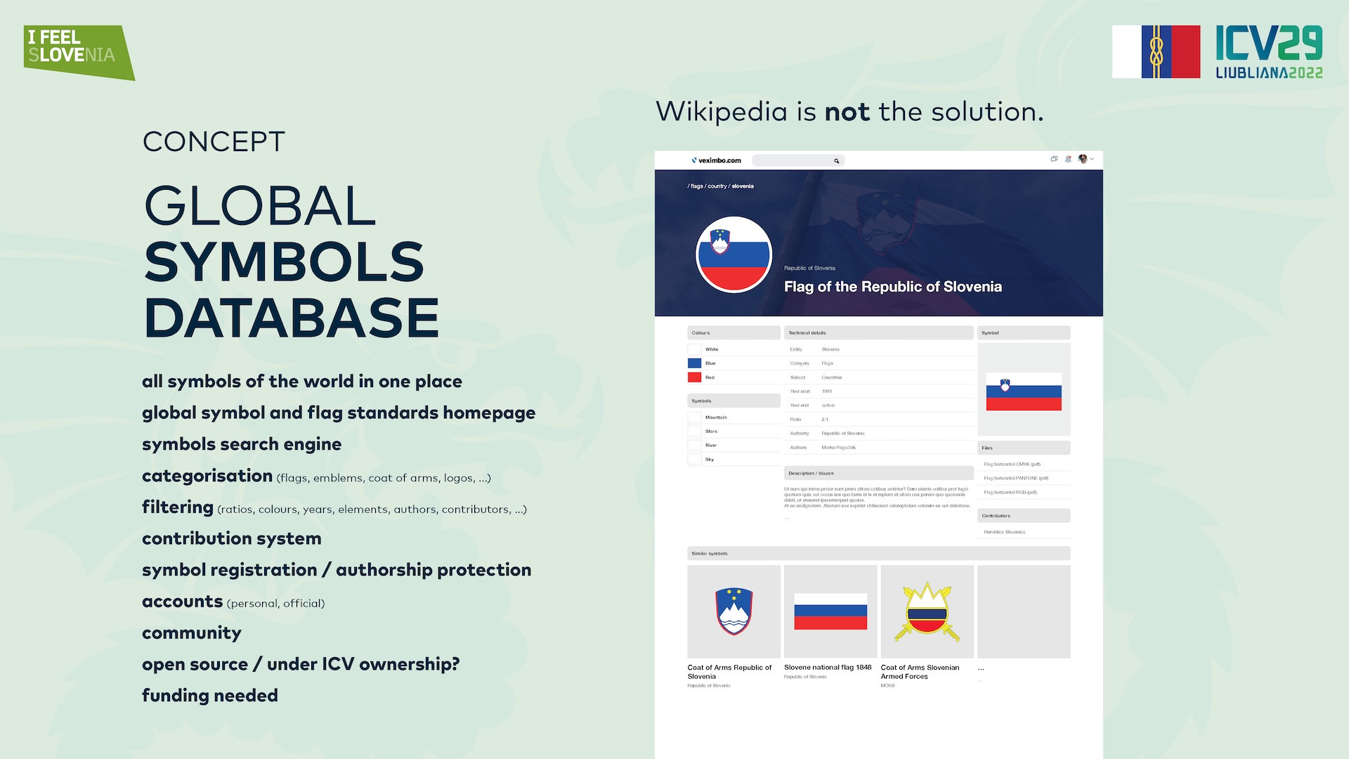
The standard should be defined by the owner of the symbol and not only presented on their official channels, but also provide the symbols in all those colour definitions. Relying on Wikipedia is also not a good option as that is not the official channel of the owner of the symbol. Also Wikipedia sometimes appends the symbols in Svg format, which is RGB and then the producers will automatically take that unofficial symbol and take it for granted.
Along print colour models we also know other colour models that are used for foils or metals. Metals usually use RAL colour scale, while foils use MaCal scale or similar. Symbols should be also provided with these definitions, because symbols are reproduced not only in print but also with foils, on metal, wood or other types of applications.
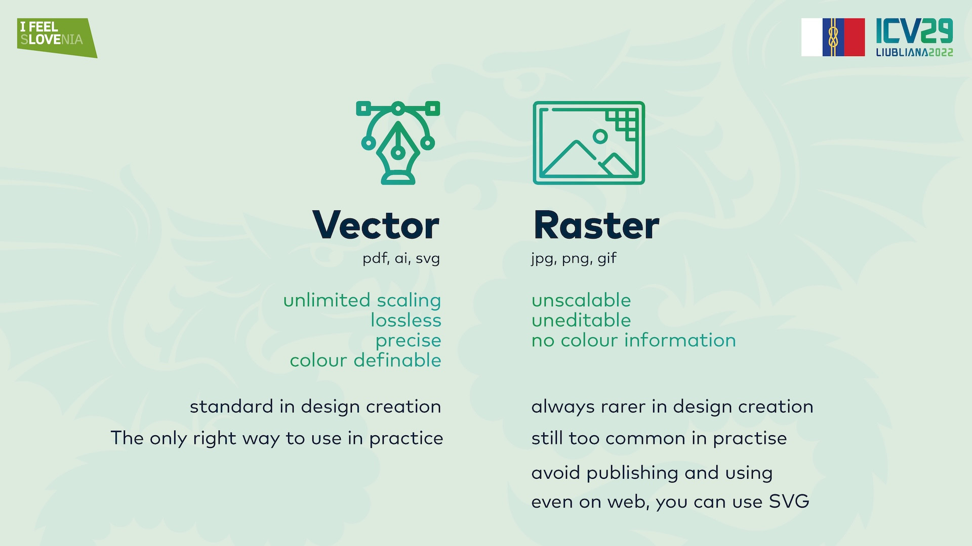
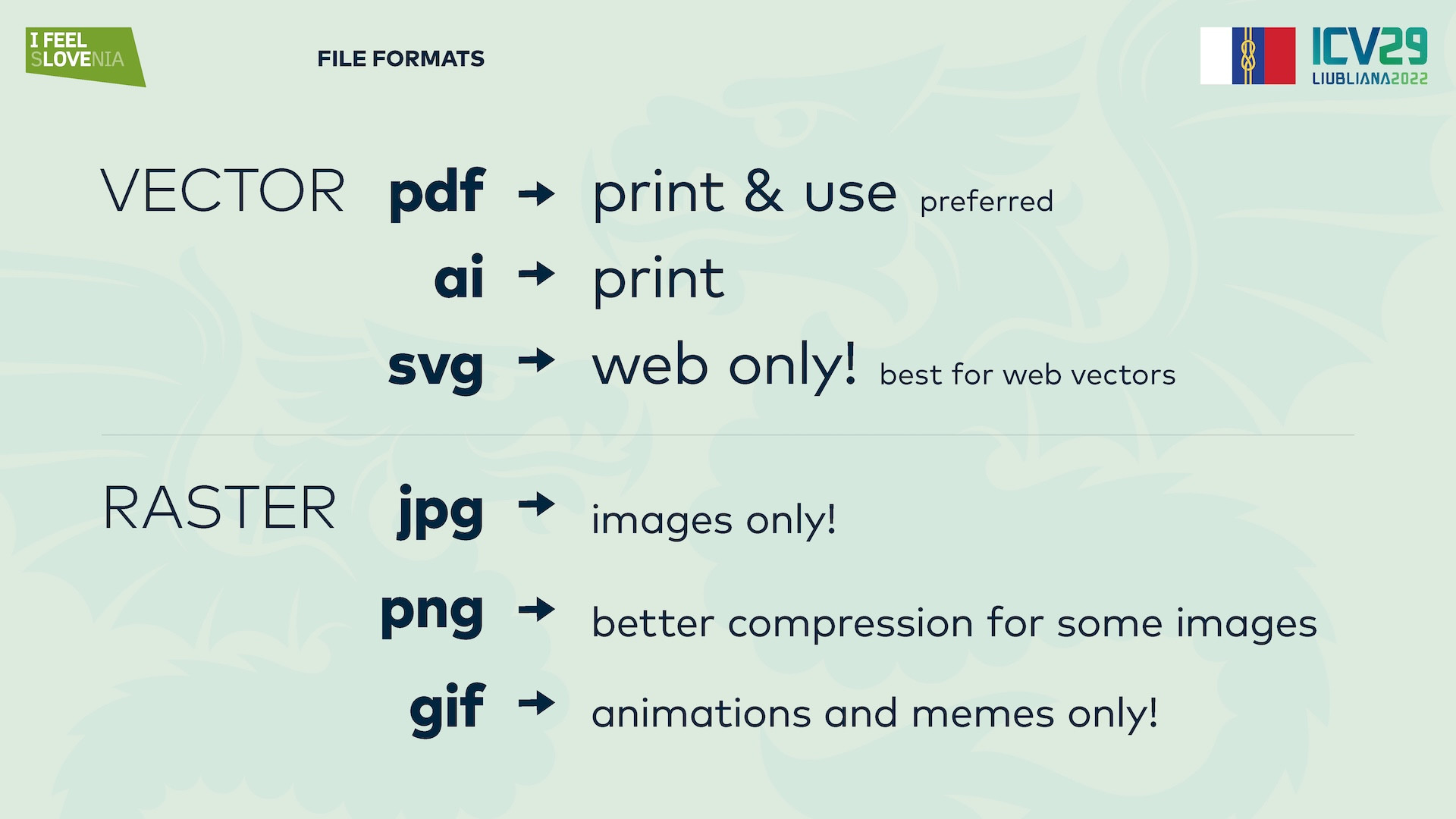
We know two types of technical design raster and vector. Raster design is a drawing that is made of pixels. This way the pictures are stored and the raster way has resolution. That means that it cannot be enlarged without losing quality. Vector type means that symbols are mathematically defined with lines, solids and every element can have an exact colour definition. Vector designs can be enlarged without losing quality so this is the correct way of drawing the symbols. There are many programs that allow vector drawing and it is left for the designer, but it is important that the program allows exporting or saving the file in the standard print formats. Svg format is a format intended just for web usage, as it is a RGB format. Svg format should therefore not be used primarily for symbol design. Common standard print formats that allow storage of CMYK / Pantone or other colour libraries are PDF, AI, or among others EPS. All of these will be good for print reproduction as every producer is acquainted with these formats, but PDF format is the most common as it also allows for previewing on every computer or browser.
It should be noted that raster formats are almost never needed for symbols and should be avoided as they encourage the use of raster images and in practice you see a lot of bad resolution symbols everywhere. If you need a web friendly format, you should use SVG as it can be included in the website, or can be imported in Word or other programs. PNG or JPG pictures should always be avoided at any cost. Even when designing a poster or an ad where the end result is a picture, you should always place vector symbols in the source project. Vector symbols will have no problems with backgrounds the way pictures will, so this will always ensure easy implementation of the symbol on any kind of background. Transparent PNG symbols should also be avoided as they have a problem with resolution and resizing. So always use vector symbols for any kind of reproduction or further design and use the colour model for which it is intended. Include CMYK symbols in print graphics, etc.
Then there is also the quality of the vector drawing. What you see is sometimes ok, or will do the trick visually, but sometimes the symbols are purely designed, with bad design practices, so they will be too big in size, they will slow down the programs, they might distort the symbol, or some lines or colours will be visible that should not be. A big problem are also gradients. Some programs cannot export good gradients, so the gradients are made of steps of colours. One gradient can have hundreds of blocks of a solid colour ad that will make a problem in reproduction. All gradients should be exported mathematically, not by single solids. Bad symbols like this will slow down or crash the programs in reproduction, and the result in printing may also vary.
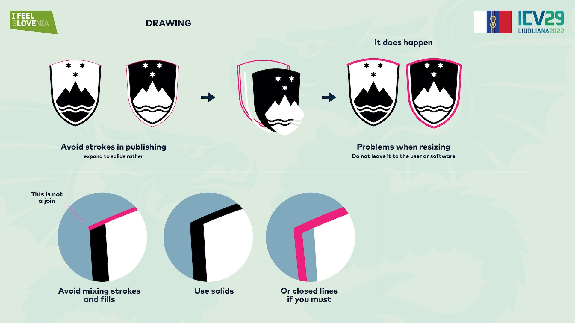
The symbols can also be drawn with lines or solids or both. Both approaches can be right, but as a good design practise, using solids is better, even for lines. We are of course talking about the final materials not the source work. Even though the lines are ok for print production they can also bring a lot of problems. Symbols placed with lines, can sometimes be placed in programs and then resized. If the design program has a setting of not enlarging lines with the size of the symbol, the lines might not resize with the symbol. The designer might not notice, but the symbol will have thinner lines or fatter lines, therefore it will not be as original. To avoid this symbols in all solids will not have that problem and you will not let it to the user to make a mistake. To do this for exported graphics all lines can be converted to solids.
For print or production applications we also use symbols in different colour variants. The base symbol is always in full colour, but sometimes monochrome or single colour symbols are needed. In print we can sometimes have only one colour, for example on textile printing, sometimes sponsors are because of homogeneity displayed in the same colour (black or white). So every symbol should also be created in a single colour variant. Symbol owners should provide and define the symbols in single colour because in practise it is impossible to avoid single colour reproduction. If the owner does not provide the symbol in this colour sometimes the designers or producers will make the symbol in single colour by their own judgement and again you will not be able to control the result. We then see so many of different interpretations of symbols in production.
As in heraldry interpretation is allowed and only the heraldic rules must be followed, symbols of countries are not only heraldic symbols but also brand symbols. And brand symbols must be displayed correctly. A coat of arms that is official must not be displayed in any other way than is visually, geometrically defined. It should not be deformed, it should not be interpreted, changed with any other dimensions, ratios, inner elements should not be touched or moved. Again this can only be avoided if the owner provides all the symbols in all needed formats, colour variants and variations.
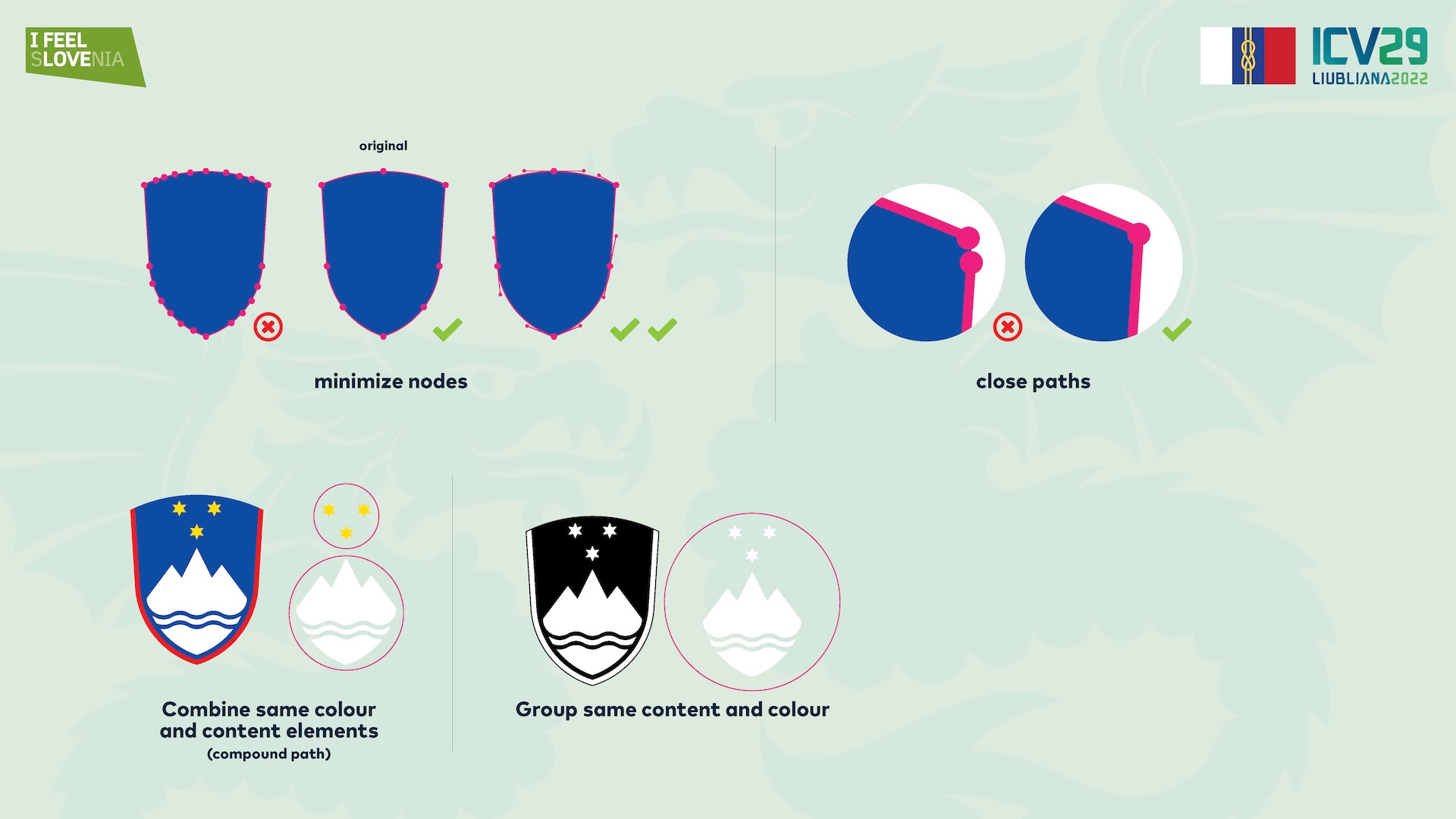
For a good technical design there are also a lot of good practices that ensure good results of the end symbol. As mentioned before there is a difference between the design process and the exported symbol. As using lines is ok or even good in the design process it is not the best in exported symbols. In the design process it is ok to overlap objects and it is also good in the end symbols as the print program will automatically cut the correct colours in print separation. Sometimes we see the different elements in the symbols that should touch but the joining lines or points are not exactly touching so some white is coming in between. Overlapping solids will be a better solution to ensure there is no space between the colours. Nodes are another problem that is not always seen in production but when handling the symbols overkill in nodes will give us a lot of problems. In vector design a line or a curve can be designed in many ways. It can be created with many small points and increments or it can be made with a minimum points and a good curves. Using minimum number of nodes and with curves is always the best solutions. Do not cut the solids which will then create many small nodes. In production every node is a potential risk, especially when symbols are embroidered or CNC printed. Especially in these usages the symbols must be perfectly made so that the programs will be able to make them. Problematic nodes will create problems and the symbols will have problems to be reproduced. Also they will be more expensive for the producers to manipulate, again changes will have to be made and all of that gives chance for failure or bad reproduction. It is also recommended to compound the same colours of the symbols. This way the symbol will be made with minimum elements. The symbols will be easier to reproduce and manipulate. In practice it also happens that some solids do not have closed paths. They are visually close, but the solid is not closed. Some programs will be able to close them automatically, but some programs in production will have difficulty to show them.
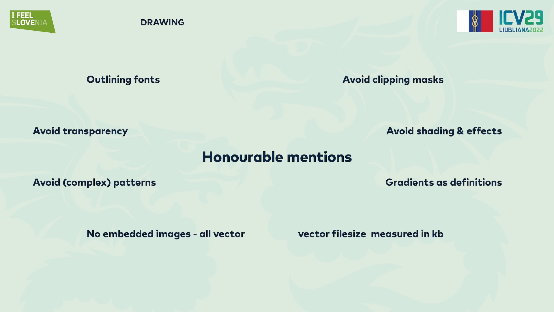
In the final exported symbol as said lines will be the best if converted to solids to ensure no one can enlarge the symbol without enlarging the lines. But if you must use the lines, do not mix lines with lines converted to solids. That is also something that is seen in the coat of Arms of Slovenia where the side lines of the symbol are made with the solids while the top line is made with a line. These to do not overlap and look good from a far, but looking closely the edges are not joined as the lines are not angled and joined on the top left and top right corner of the symbol. This is visible in the single colour version of the coat of arms. A honourable mention here is also to outline fonts. Yes event that is commonly seen in the end symbols. Symbols use fonts that are not outlined and then in manipulation the fonts break. Also some symbols use advanced filters, transparencies or effects like shading. All of those should be avoided in symbol design. Do not use shading as that will become rasterised graphics and again the mixing of vector and raster graphics. In the end a good symbol is always a few kilobytes in size. If you have a symbol measured in megabytes, there is something wrong with it.
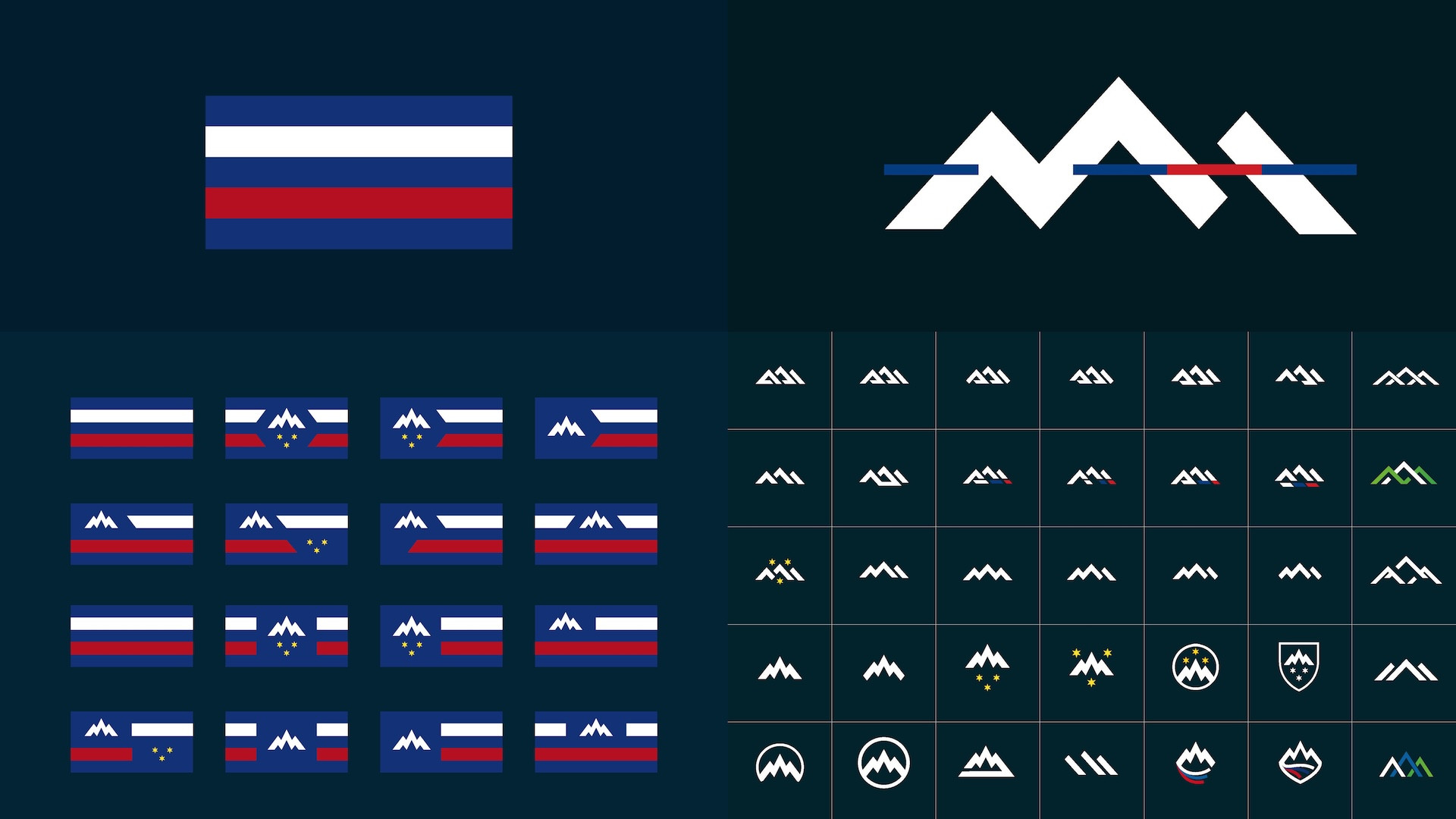
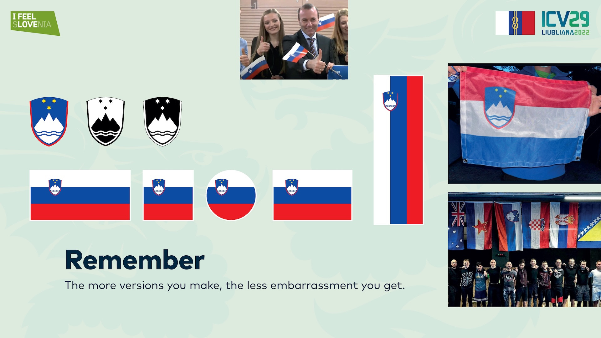
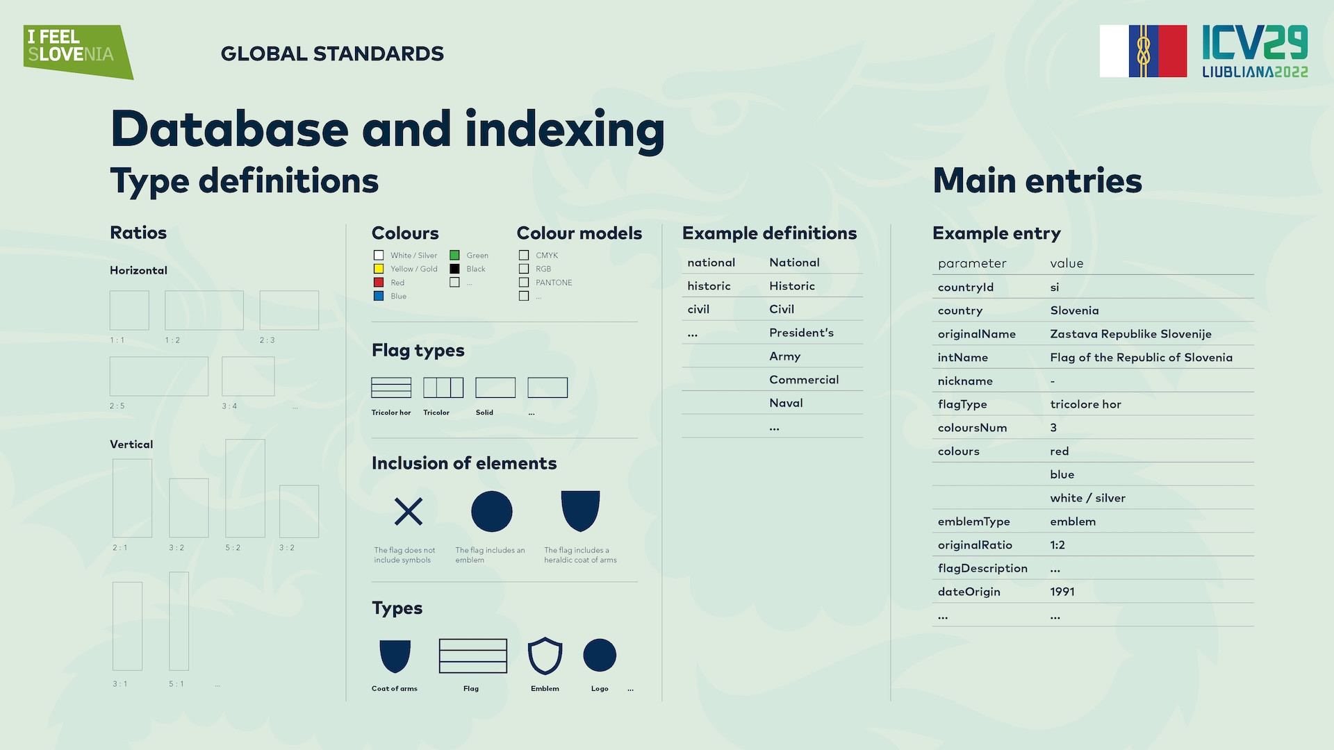
Why do we need standards and well designed symbols? In reality we all see symbols, mostly of our national symbols that are exposed the most in wrong usages. Colours are mismatched, sometimes in the wrong order, symbols are enlarged on the flags, deformed, flags are not presented in the right ratios and represented in the wrong light. We feel that the users are to blame, but if we did not provide them with all possibilities for all usages, they will just make them as they feel. This is the most prominent in sports. Flags and symbols are displayed on monitors, on results pages, sometimes they are placed in a circle, in a square, sometimes they are flying them vertically, they are rotating them as they feel, but the usage of the symbols in different masks or shapes cannot be avoided. Most of the broadcasters no matter of their competency just get the symbols from Wikipedia or worse. The symbols were just placed as they are, but we did not provide the standard with them. We can also not count on the users or producers to go look at vexillological rules or country laws. We are the ones that should provide the symbols in all of the shapes and positions, so that in case of usage in circles, they will use the symbol that we defined how it should look in a circle. We should define the look of the circle in vertical usage and that does not just go for the standard, we should also provide the file in that position, we should not rely on them to rotate it. As this is of course not possible to do for every usage case, we should at least cover a lot of common usages. Horizontal and vertical position of the flag, flag in other ratios than our own starting from square, circle, to 2:3, 1:2 and perhaps even longer ones. All these ratios in the end will be used if for nothing else, when the producers are faced with positioning all the flags in one standard they will of them in a ratio let’s say 2:3 and if your flag is not in that ratio, they will cut it or prolong it, again by their own vision. So we should not enforce them to use our standard as in the case of multiple symbols it is impossible, we should create them in all of those standards, or as I am proposing in a global standard that includes all symbols in all basic forms of use and basic sizes, ratios, positions.
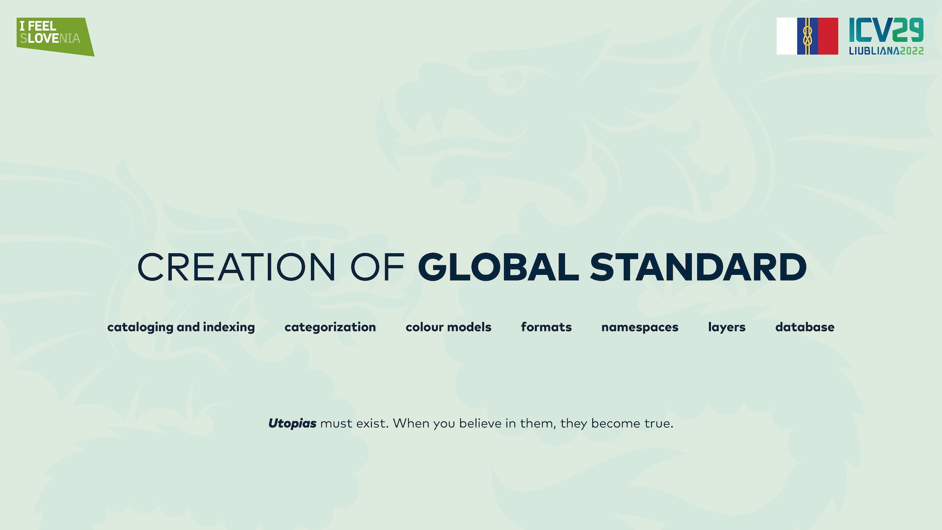
So I am proposing a global standard for symbol sharing and usage. Utopias must exist, but if we believe in them we will get closer to them and definitely come closer to intended use of the symbols. The standard should not break creativity or the design process, it should just touch the end symbol. The standard should define all the file formats that are needed for any king of reproduction, it should define the colour definitions that are needed for every symbol, rations in which the symbols (or at least flags) should be provided with and perhaps name spacing and categorisation of the files for usage, so that the files should be understood even before opening them. After that technical design quality should also be addressed so that the symbols would be prepared properly. As a designer and a digital software creator I envisioned a symbol platform where all world symbols would be uploaded and categorised, where all symbols would be maintained by their owners and so all symbols for usage would be official and confirmed for usage. This kind of platform is a big enterprise so I cannot do it myself, it would be a startup and a dedication for which I am preparing myself for maybe sometime in the future. But for now the idea exists and I am listing and compiling the standards that would be needed for this kind of undertaking to succeed.
Sources: